Safety Exchange
Safety Exchange originated as an app prototype project for the Interactive Design course at Liberty University. This project deepened my understanding of UX and UI design processes and taught me the essential phases and layouts involved in such projects. The app is designed to promote safety awareness among female users and to enhance brand visibility in spreading the message about women's safety.
Icon
This icon was designed for an app to help users quickly recognize the application in app stores and social media campaigns. The image is simple yet distinct, making it an effective representation of the brand, which primarily exists online. The icon symbolizes the promotion of communication focused on safety awareness.
App Model Design
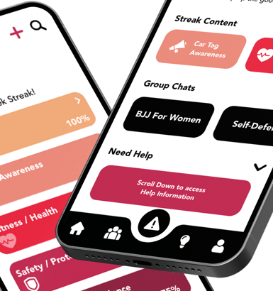
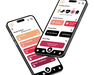
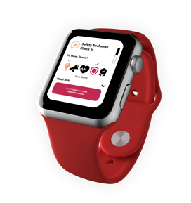
The final design communicates with the target audience through a clean and minimal app layout. The organized content is easily accessible throughout the app. The prototypes feature calming animations that users prefer and engaging interactions that encourage users to return to the app frequently, such as a weekly content streak and positive community groups that foster mutual understanding and growth.
The app’s spacing, background colors, and layout are carefully structured to provide comfortable access on each page, enabling users to understand and transition smoothly to their desired locations. The popular content buttons on the quick access homepage allow users to easily find specific areas they enjoy, reducing the number of pages they need to navigate initially.
The research and design phases were conducted to focus on the target user and ensure a positive experience throughout the app's layout.